Oracle · HCM Cloud
Change Salary.
- Problem Off-cycle salary changes were critical but infrequent, so the redundant read-only default view and an overloaded form left managers relearning the task every time.
- Solution A mobile-first, three-step flow that surfaces only what managers need, with a justification field and full mobile support.

Impact at a glance
- 63% faster Usability testing cut the average salary-change task time by 63% on the redesigned flow.
- 83% CSAT (n = 47) Strong customer satisfaction from existing customers surveyed on the proposed designs.
- Beyond the brief The work grew into a pay-equity proposal surfacing an Adjusted Average Salary.
Challenge
A critical task that wasn't performed often.
Changing salary off-cycle is critical, but managers rarely do it. The experience needed to be clear and intuitive every time, not muscle memory.
Understanding the user problems
Where the existing experience was failing managers.
1. UX misalignment
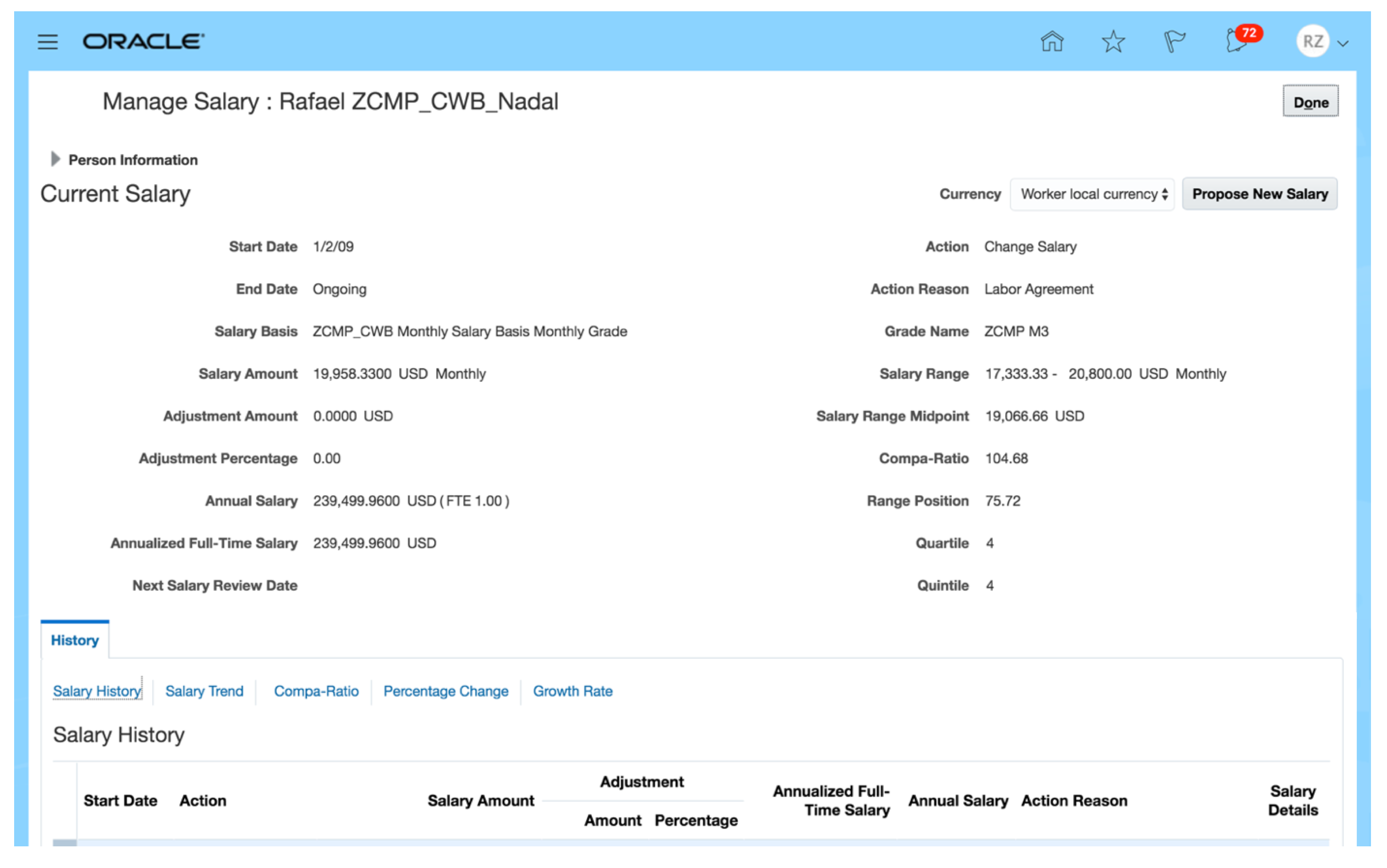
Managers came to this page to edit salary. The default view was read-only, making the page redundant to the task they arrived to do.
2. Information overload
Most fields on the page weren't required for the task. The noise pushed average completion time to 3 minutes 52 seconds.
3. Additional features
Justification and mobile access were the two most-requested gaps:
- A way to offer justification for a salary change, to support the case.
- Mobile support, since many managers were desk-less.
Goals & metrics
What success looked like.
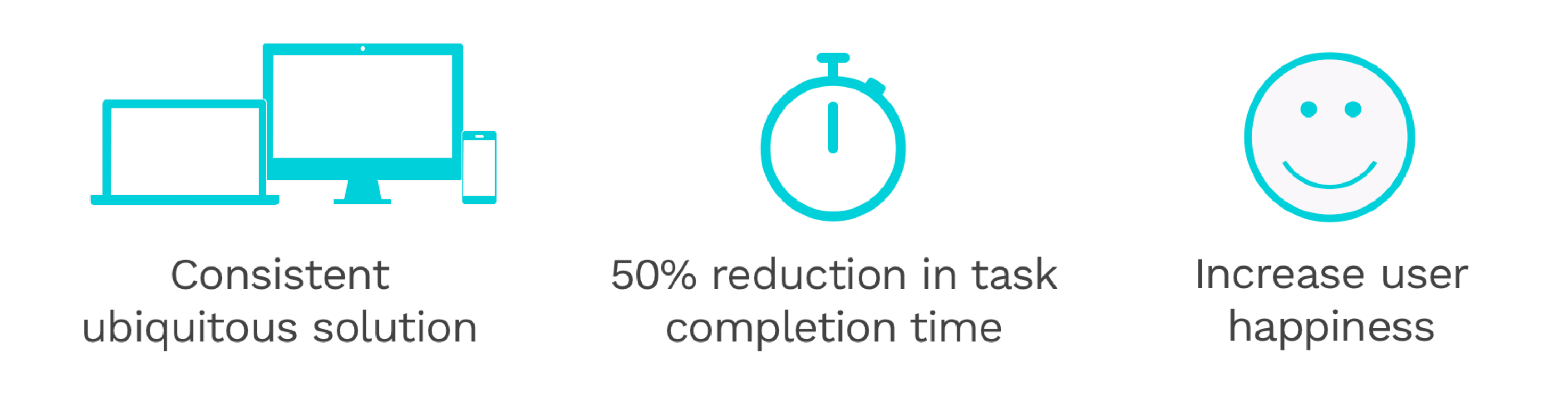
Success meant faster, clearer, and mobile-friendly.
From problems to solutions
Mobile-first to force prioritization.
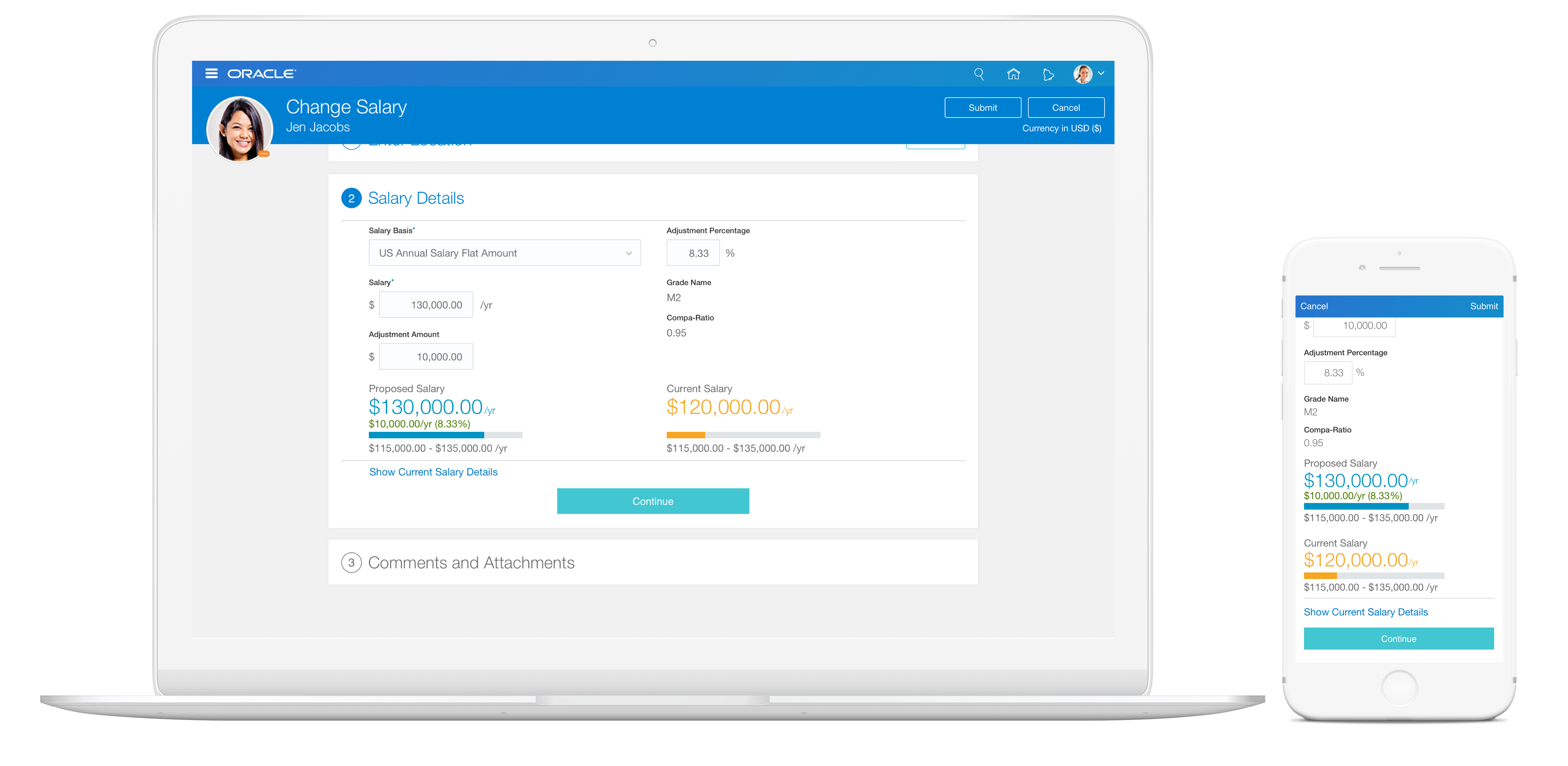
Designing mobile-first forced prioritization. Three sections carried the whole task:
- Start date and reason for the change.
- The salary changes themselves.
- An optional justification.
Feedback simplified this into a step pattern: a fixed, clearly structured sequence.

Final design
A clear, intuitive, mobile-friendly flow.
Outcome
Faster task completion, high customer satisfaction.
Testing with two UX researchers showed a big drop in average task time, confirmed by a strong satisfaction survey of existing customers.
-
Task velocity
63% reduction in task time.
Usability testing showed a 63% reduction in the average time taken to complete the salary-change task on the redesigned flow.
-
Customer satisfaction
83% CSAT (n = 47).
Surveys with 47 existing customers returned a strong customer satisfaction score for the proposed designs.
Extending the scope
From a salary form to a pay-equity opportunity.
While immersed in salary and compensation, I came across a headline: "San Francisco Wants to Eliminate the Pay Gap for Women in This Generation. But Will It Work?" As a woman in tech, in the tech capital of the world, I felt I was in a position to influence change.

Companies fall across a pay-transparency spectrum, from a paycheck with no context to full visibility into who earns what, largely a function of company policy.

I proposed surfacing an Adjusted Average Salary, benchmarked by level, experience, and education, to managers, and extending it to employees viewing their own pay. Transparency here could build trust and improve engagement, not just close a comparison gap.

Reflections & design takeaways
Always know what the story is. A visual refresh is straightforward. Understanding the people problem behind the product is the harder, more important work.
Respect the opportunity. This project let me pursue a personal initiative and showed me I was in a position to influence change. That's worth respecting when it shows up.