Bloomberg · Terminal
Redesigning Speed Dial.
In 2013, Bloomberg was rethinking the terminal experience to make it simpler and more relevant to the people who lived inside it all day. As an intern (and then co-op) on that effort, I helped redesign Speed Dial — the application traders and brokers used to manage contacts and pricing distribution.
My role
Research, design, and iteration end-to-end.
I was responsible for conducting the initial research, translating the findings into design directions, and iterating on those designs through rounds of user testing.
Domain knowledge
Learning the terminal before touching the design.
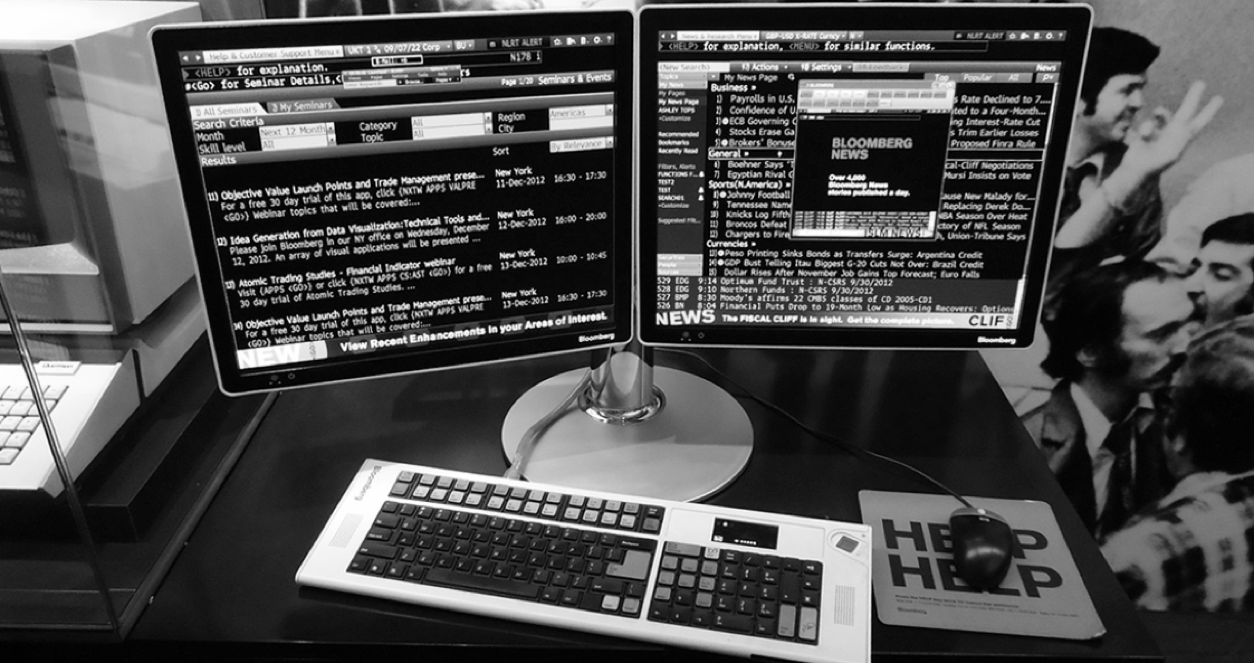
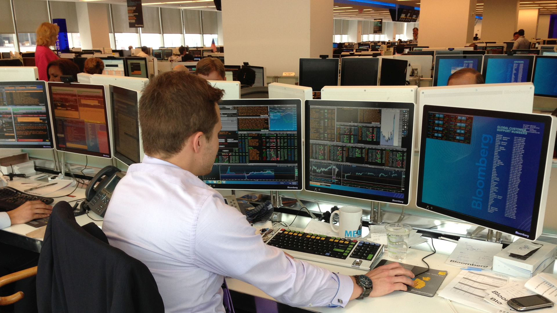
To genuinely understand our users' problems, we had to get familiar with the Bloomberg terminal — both the unique hardware and the software experience. Spending time inside it ourselves grounded everything that came after.
Challenge
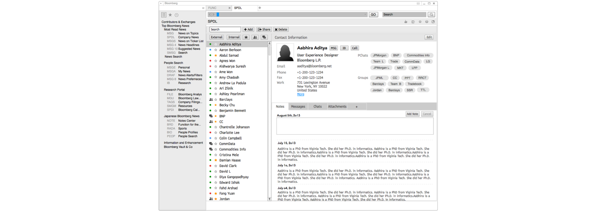
A legacy tool sitting on a critical workflow.
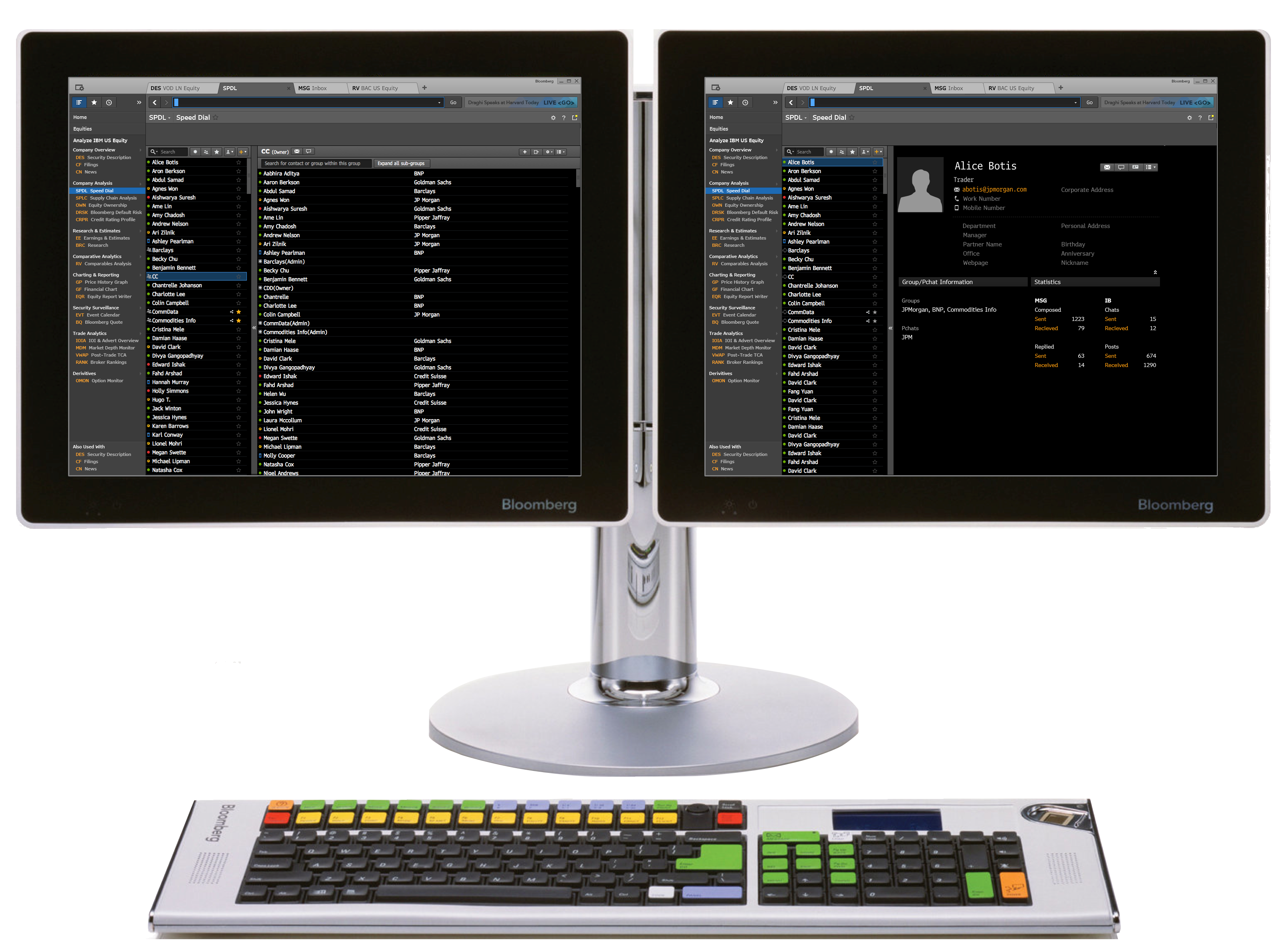
Speed Dial was how traders and brokers maintained contacts, set aliases, shared their network with teammates, and pushed pricing information out to the people who needed it. Because so much real communication happened through it, every usability issue carried weight. The redesign needed to untangle a legacy app without disrupting the daily work flowing through it.
"Phase I asked what the ideal product looks like. Phase II asked what we can ship."
Project structure
Two phases — exploration, then constraints.
The work split cleanly into two phases. Phase I focused on user needs and design exploration. Phase II layered in stakeholder requirements, engineering constraints, and the broader terminal vision.
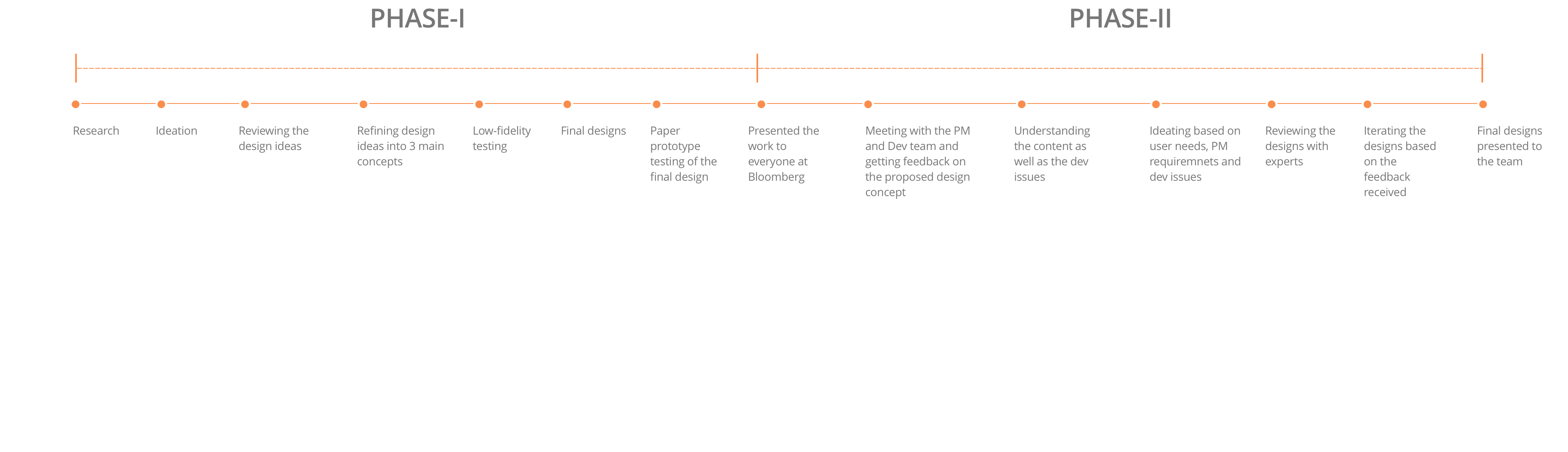
Phase I · Research
29 users, three weeks, semi-structured interviews.
We ran semi-structured interviews with 29 users across different roles over three weeks — deliberately mixing job functions to surface how usage patterns varied across the desk.
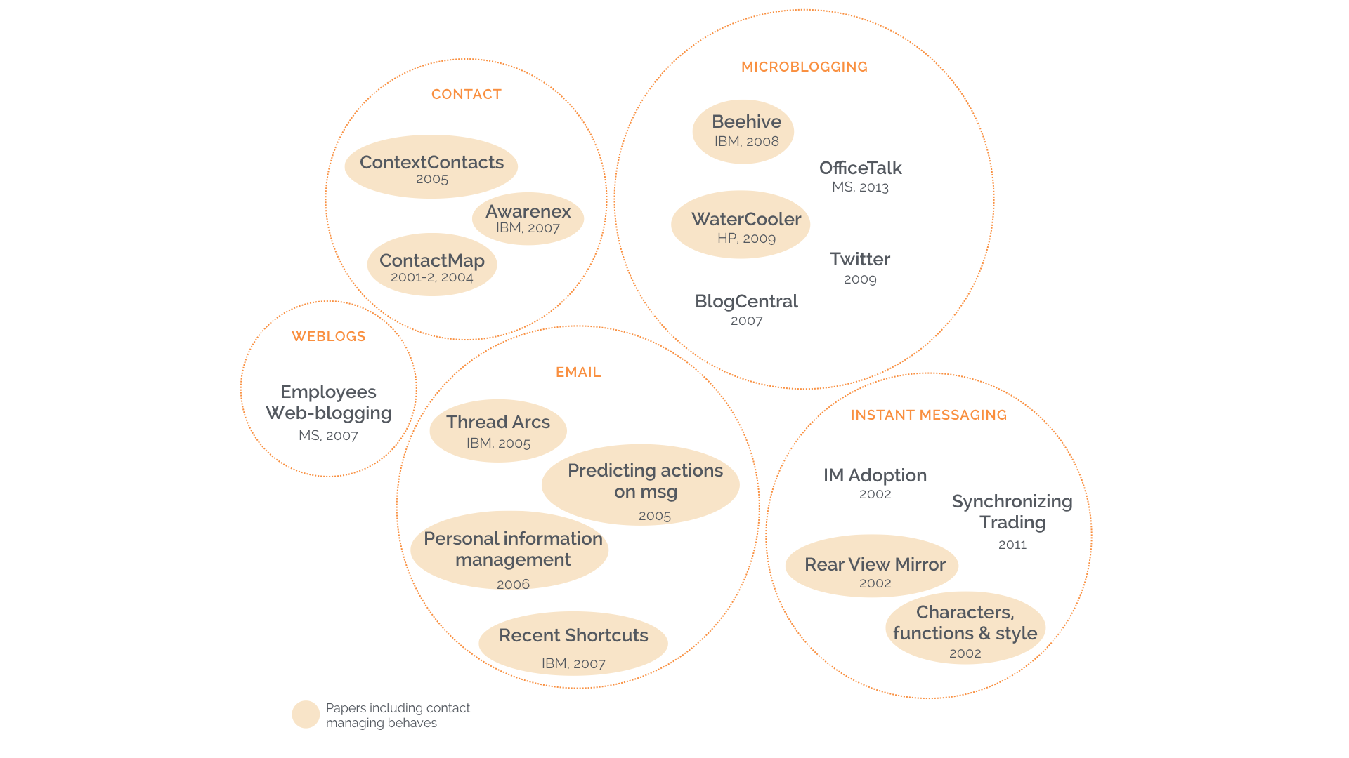
Phase I · Literature review
Mapping the territory before sketching.
In parallel with the interviews, the team ran a competitive analysis and reviewed research literature to build a foundational understanding of the problem space.
Phase I · Data analysis
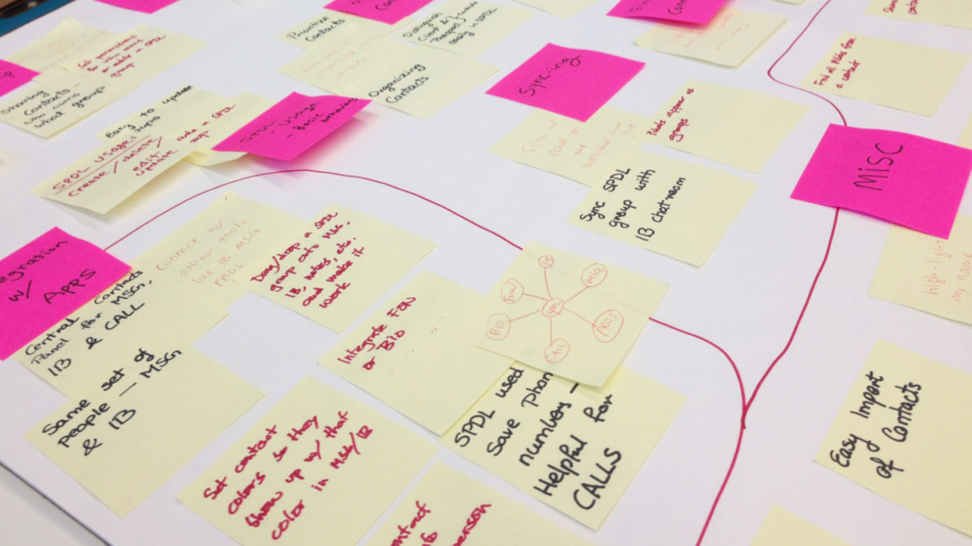
Open coding and affinity mapping.
We analyzed the interview data quote by quote using open coding and affinity mapping — letting themes emerge from the transcripts rather than projecting them onto the data.
Phase I · Idea generation & design
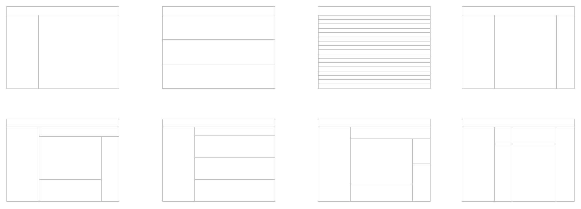
Many concepts, refined down to three.
From the findings I generated a wide set of design concepts, then refined them with feedback from domain experts. That process narrowed the field down to three primary directions worth testing.
Phase I · Testing
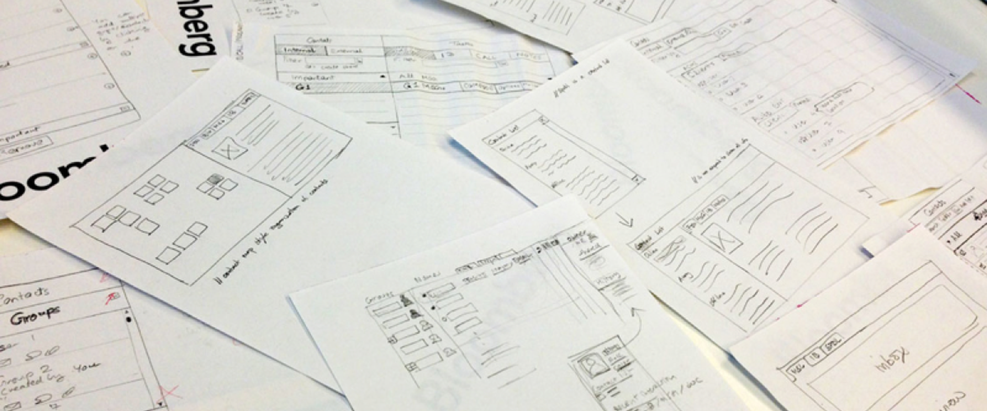
Three concepts, paper-prototyped with the original users.
We tested all three concepts as paper prototypes with the same users we had originally interviewed — so the feedback could connect back to the problems they had described in their own words.

Phase I · Final design
One unified design, drawing on all three.
The testing results informed a single unified design that combined the strengths of each of the three concepts.
Phase II · Reviewing the proposed design
Where the design met engineering reality.
Meetings with product management and the development team surfaced technical constraints that meant parts of the proposed design needed to be reworked.
Phase II · Iterating
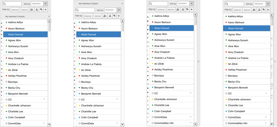
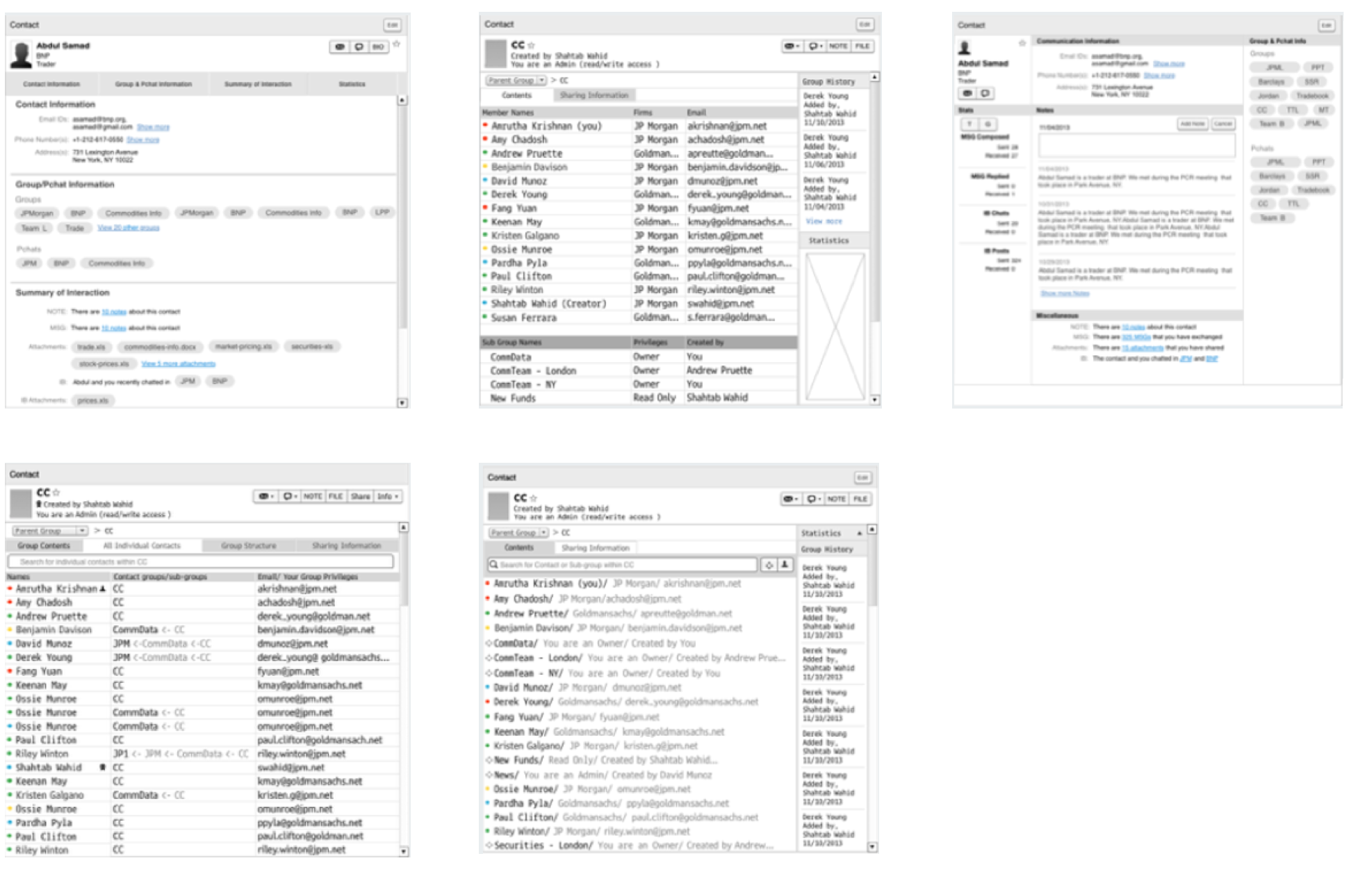
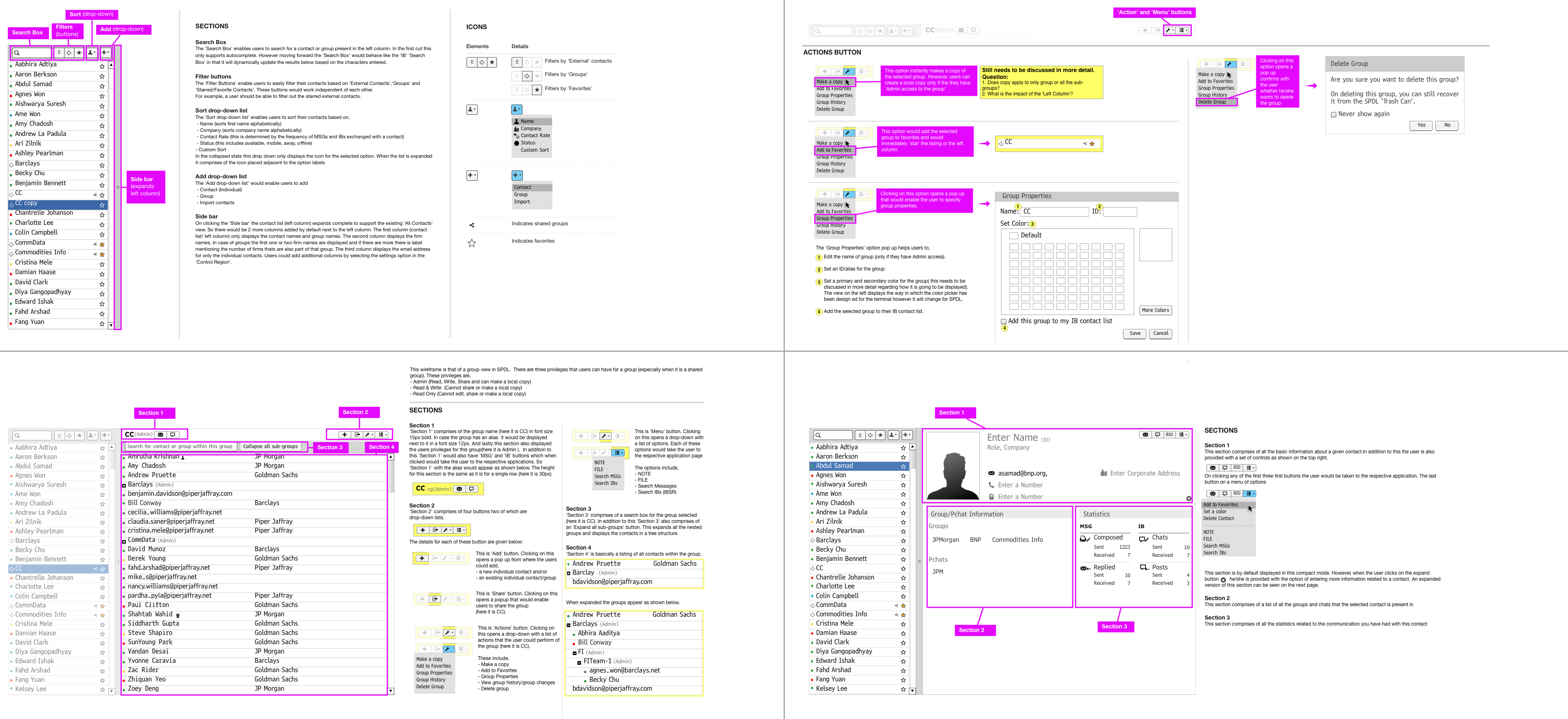
Refining the left and right panels.
We went through several rounds of refinement focused on the left and right panels — tightening the interaction model until each panel earned its place.
Phase II · Final design
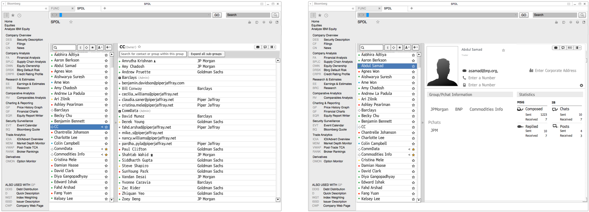
Group and Individual views, with specs.
We converged on final wireframes that covered both the Group and Individual views, then handed off detailed specifications to development.
Overall impact
From a 3-month internship to an 8-month co-op.
The work was well received, and the engagement was extended from a 3-month internship into an 8-month co-op so I could keep working with Product and Engineering to build the product—it was no longer an academic research project.
-
Unified design
One pattern, broad reach.
The testing results converged on a single unified design used across the affected terminal workflows, replacing fragmented one-off treatments.
-
Engagement extended
3-month internship → 8-month co-op.
Strong reception of the work led the team to extend the engagement so I could partner with Product and Engineering to build the product—no longer an academic research project.
Reflections & design takeaways
Designing for the Bloomberg Terminal taught me that on a screen this dense, restraint is the design move. The win wasn't in inventing a new pattern — it was in finding the one pattern that could carry across the affected workflows without disturbing the muscle memory traders had already built up over decades.